Nowadays, the consumer, when taking any packaging, has specific expectations of it that should be met. In addition, it must perform its role well. Fortunately, packaging design evolves every year, so that emerging trends can meet the expectations of the most demanding customers and their changing needs.
Packaging serves many functions, and today its main role is to fight for the consumer’s attention. Brand managers therefore attach great importance to making the packaging stand out on the store shelf. The psychology of consumer behavior clearly shows that a customer makes a decision to buy a product in just a few seconds, which is why designing packaging based on the latest trends and customer needs is so important.
Here are 10 treds in packaging design
1. simplicity
2. pastels
3. gritty
4. movie posters
5. big words
6. unique shapes and materials
7. retro style
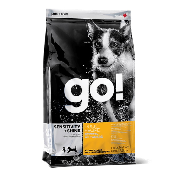
8 Photography
9. holographic effects
10. vibrant gradients
1. simplicity
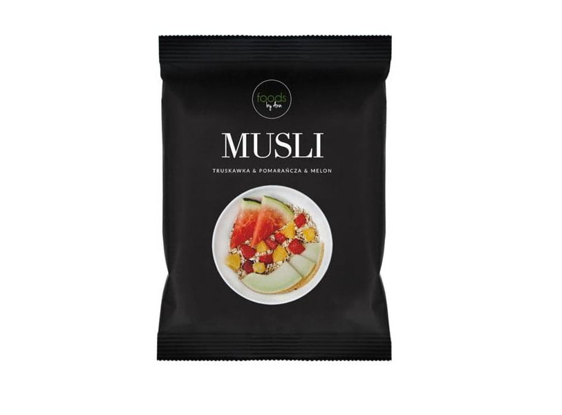
Minimalist design has been around for a while and it won’t change for a long time. Although it may seem a bit boring, abstract and primitive, keeping it simple plays an important role and helps you find what interests you.
The hardest part of how to go minimal is finding symbols and signs that will appeal to most buyers. By using the symbolism of a few words, the consumer will linger longer on the packaging, just so they can focus and understand what your product is about.

2. pastels
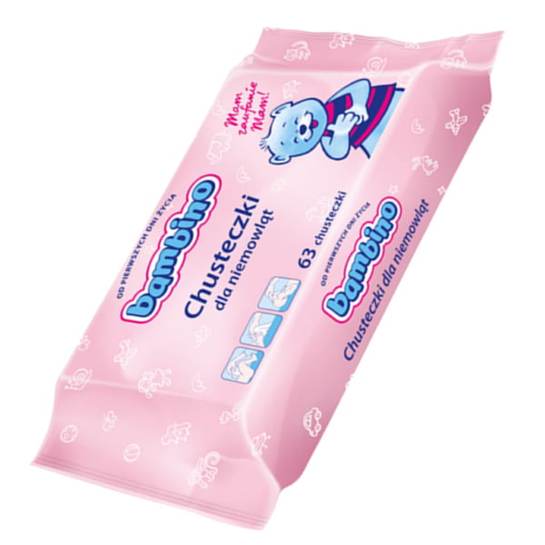
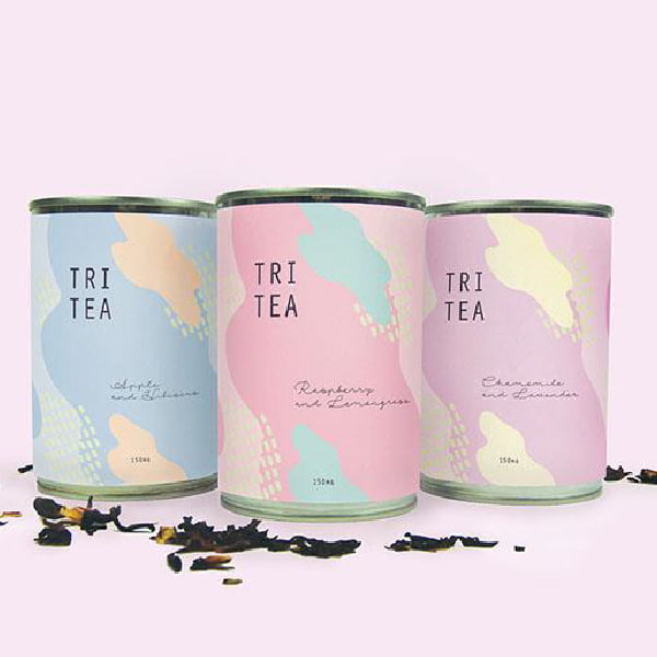
Feminine, calming packaging designs in pastel shades will see a resurgence in 2018. Pastels are a natural reaction to the hyper-stimulating and explosive colors we’re seeing more and more of on store shelves. Reduced saturation makes pastels an excellent choice for creating a soft, pale effect that lends lightness and warmth to a product, which translates into a pleasant and welcoming message for a potential customer.
Instead of being bombarded with numerous colorful stimuli, we prefer to quietly look at, touch, smell, taste and ultimately buy the pastel product.
3 Drawings
We’re talking about grits ranging from 9-year-olds to 90-year-olds, so we’re hitting the target market. Adults relate to these kinds of drawings sentimentally, because they remind us of the energetic, happy children we all used to be. And let’s be honest: a good scribble can put us in a great mood every day.
The drawings and inscriptions visible on the packaging can turn the product into a fun universe that was born from someone’s imagination and shared with the world. They also have a wonderful way of describing what is inside the box. This makes us smile many times before we even open the product. And buying it is often a foregone conclusion.
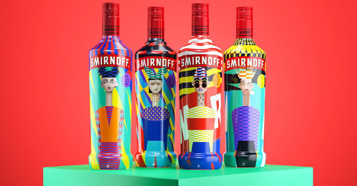
4. movie posters
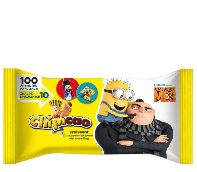
What better way than to evoke the same atmosphere and narrative as movie posters, which can be as revered as the film itself. Movie posters for packaging will always go from informal supporters to ardent collectors. It is not easy to achieve such a wide
and effective market reach. Such poster design speaks with a narrative that is closely tied to the product itself, creating a unique identity.
5. big words
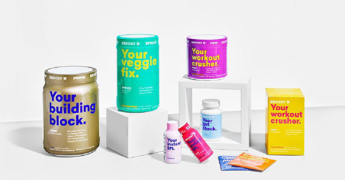
If you want to convince consumers of your product in a simple, clear and unambiguous way, great words may be just what you’re looking for. Words and slogans are a great way to get your product noticed. Whether funny or serious a clear message will work well in an easy-to-read font. Combined with smart color choices, your product is sure to pass muster.
6.Unique shapes and materials
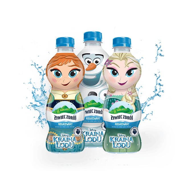
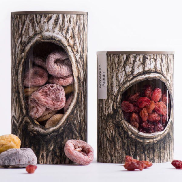
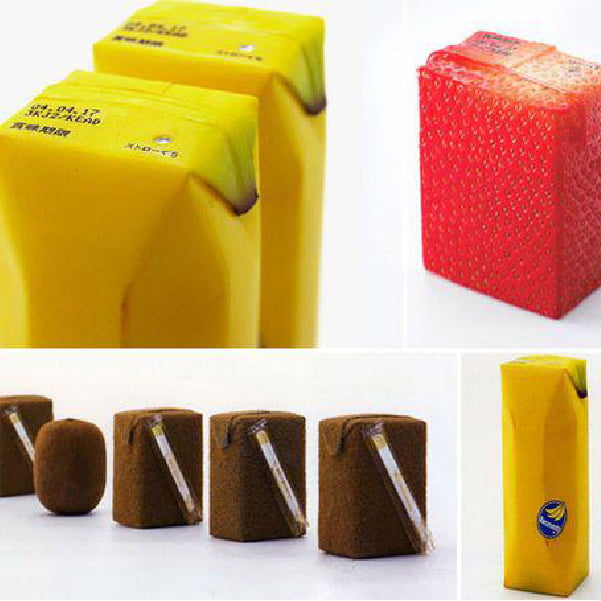
Those who don’t pay attention to words or pastel colors, but look for products with innovative shapes and materials, are among the group of consumers who are interested in “extreme packaging.” Turning a can of juice into a bamboo segment or a resin segment into a tree trunk literally means that the only thing left to do is to put a logo on the package. No other words are required. This technique effectively and impressively shows how to make your product draw attention to itself.
7 Retro Style
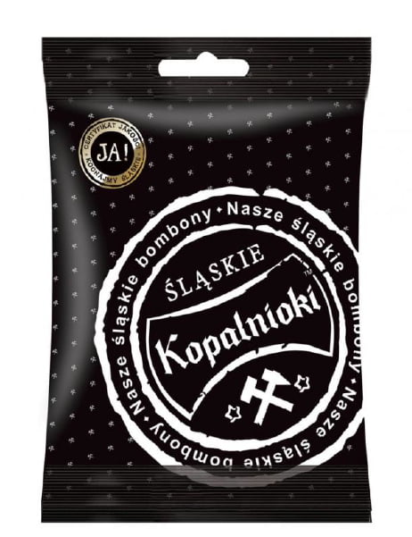
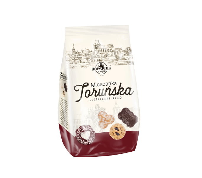
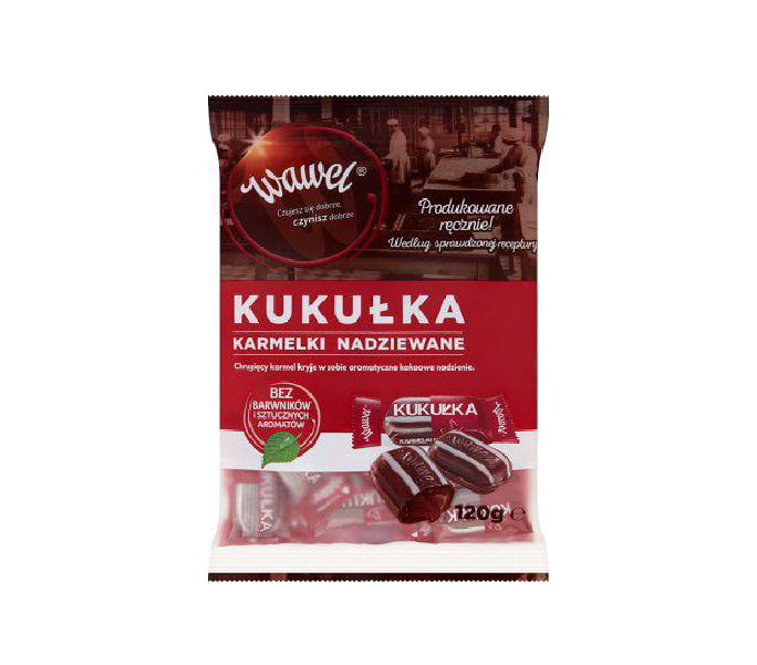
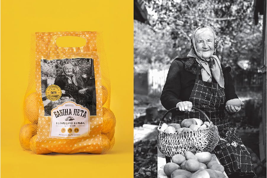
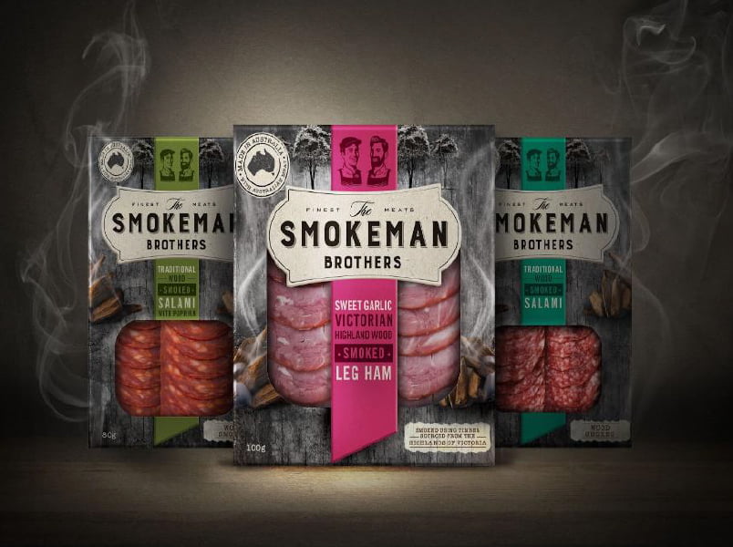
For several years now, we have been observing a fashion for retro packaging. In the era of globalization, a lot of people are looking for regional “peculiar products” that are associated with family cuisine. They refer to old recipes, natural ingredients, while telling a story of tradition, respect and passion. Of course, retro has many facets. From Art Nouveau glamour, to the avant-garde of the interwar years, to pin up styling, and even the classic communist original. Each of these facets can apply differently and target a different product group. The precise choice of the era to which we want to refer will be the key to the success of the entire retro venture. This treatment suggests to potential consumers that these are products that may have existed even decades ago. Only actually – what’s the point? The answer is simple. It is widely believed that items produced “back in the day” contain fewer preservatives and artificial ingredients than they do today. This builds trust with consumers, who begin to associate the product with something natural, devoid of unhealthy chemicals. Here it is worth citing the example of Krakowski Kredens (which draws on both these trends), Wawel or regional breweries.
8 Photography
Photos are used successfully in most packaging. This is especially true in the following situations:
a) when we need to show the product on the model, it is best to use a photo. Drawing pantyhose does not have an interesting effect, although such packaging does happen.
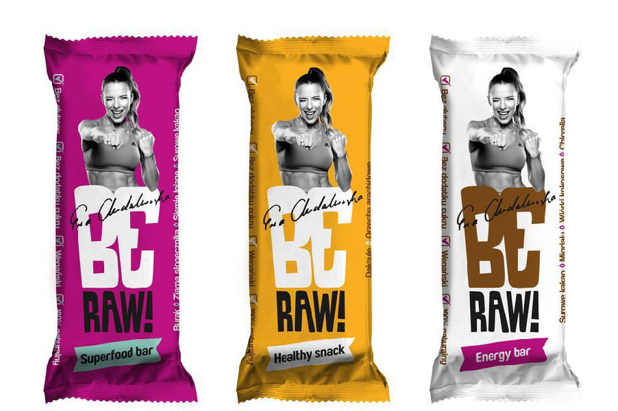
(b) when you have hired a well-known person, it is better to use their photos than to try to recreate them with illustrations. Of course, there are exceptions to this situation.
(c) when a model uses the product. For example, a child plays with a toy that is inside the package.
(d) photos of dishes are also more “tasty” than their illustrations
(e) when the photo is to show the action – the effect of using the product. For example, a slim athletic model on a package of fit flakes. Or shapely thighs on a package of anti-cellulite cream. Other emotions are shown by cigarette packaging with text warnings and photographs of diseased internal organs and cancer-damaged tissues. Such photographs show the negative effects of smoking and may encourage people to quit.
What do all these photographs have in common? It’s simple-they lend authenticity to the product.
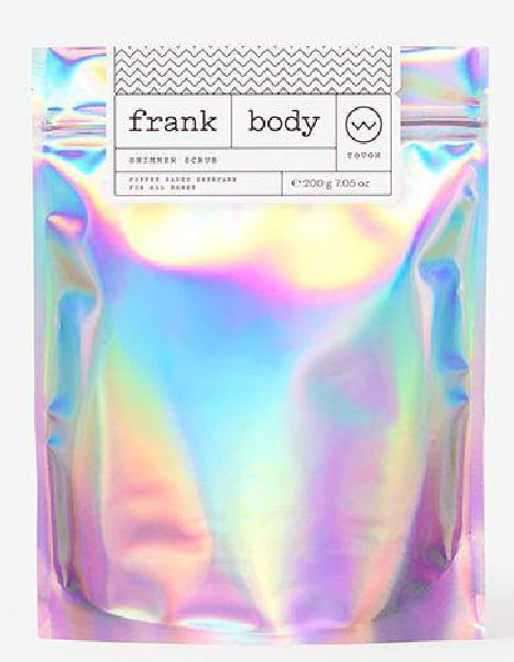
9. holographic effects
Holographic foil stamping can turn ordinary packaging into extraordinary. The depth, three-dimensionality and variety of colors add brilliance and value to any package. The holographic effect on the design makes such packaging elegant and original. Simply put, it draws attention to itself.

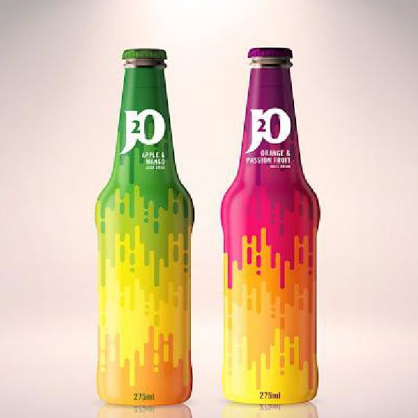
10. vibrant gradients
Since the advent of flat designs, gradients have been dormant, waiting for the “right time” to make a comeback. Now the use of gradients can be seen on paper and film. We are seeing more and more colorful, linear transitions, which further add depth and shape to packaging.

